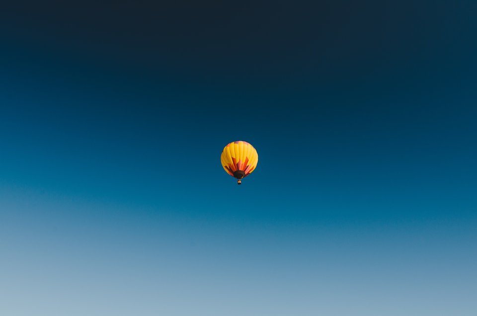
Classic Blue is a simple yet elegant color that imprints the sensation of peace and optimism, offering a harbour to the constant need of improvement that technology keeps pushing on society. PANTONE has chosen this colour to represent the year of 2020 thinking that people needed a more easily relatable and non-aggressive perspective to take us from the online and force us to go back inside, to rethink our beliefs and have faith in our roots.
It seems that PANTONE was predicting the global pandemic that the covid-19 would bring and the need to seek some comfort, an "anchor" within ourselves. Isolated in our homes, we never needed so much some kind of refuge from the uncertainty that this new era brings. The Classic Blue provides a more introspective and dreamier view of the world. The color appears to be specially fitted for this moment when you take in consideration that the hue is both genderless and seasonless, being at the same time accessible and desirable.
“We are living in a time that requires trust and faith,” said Leatrice Eiseman, Executive Director of the Pantone Color Institute, “It is this kind of constancy and confidence that is expressed by PANTONE 19-4052 Classic Blue, a solid and dependable blue hue we can always rely on.” She completes by saying that “Classic Blue encourages us to look beyond the obvious to expand our thinking; challenging us to think more deeply, increase our perspective and open the flow of communication.”

In this new era is also time to reflect upon our relationship with the environment and search for a more sustainable lifestyle. As this description can be achieved naturally from plants and dyes, PANTONE maintains the focus in the sustainability movement, created with the selection of Living Coral as the 2019 Color of the Year.
Reflecting the sky at dusk and deep ocean, Classic Blue also urges us to rethink our relationship with these natural elements. Observing that this is the month to celebrate the oceans, which covers more than 70 percent of our planet and is the home to millions of Earth’s plants and animals that are constantly threatened by pollution, sedimentation, and global warming, it’s impossible not to link the color with the theme.

According to National Geographic, humans are responsible to most of the damages the ocean is suffering. Plastic poses one of the biggest known threats to fish, seabirds, and marine mammals as they drift loose around the world - about eight million metric tons are disposed at the oceans every year. Ships spilled oil, garbage and the fertilizer runoff from farms turn the ocean into big dead zones, killing all the life it guards
The hope 2020 brings as the beginning of a new era is reinforced by the choice of the 19-4052 Classic Blue. It’s time to pay more attention to the planet and reflect upon our acts. Sooner we will feel all the effects of our bad acts, whether on the environment or on ourselves. This is a color to reassure but also to encourage us to seek to be the best version we can be.

“The sky at dusk – it’s not a midnight blue, it’s thoughtful, but it’s not so deep and mysterious. It speaks to our feelings of anticipation, when you think about the sky at dusk, the day isn’t over. You’re thinking, what’s ahead of us? It’s reassuring, but thought-provoking.” - Leatrice Eiseman, Executive Director of the Pantone Color Institute
by Priscila Ponte


